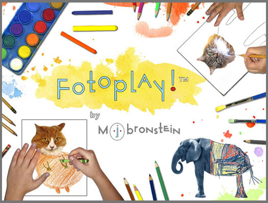
fotoplay book cover design
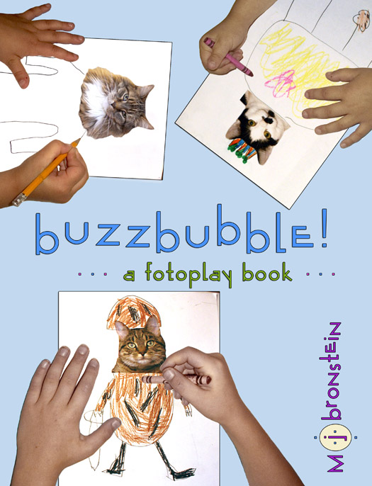
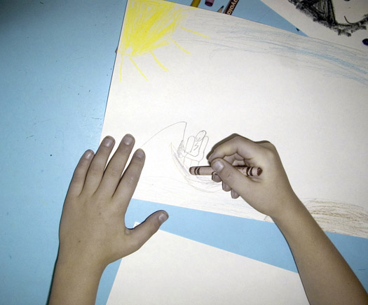
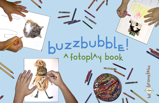
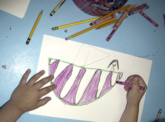
I spent this past week still completely immersed in refining the design of my Fotoplay book and after a “final” redesign of my cover, I’m taking a moment to look back on the process, which I hope you’ll find as interesting as it was for me. In my last post, I wrote about the role design plays, in helping to distill and hone ideas. In the case of Fotoplay, all aspects of design–the making of the photographs, the composition on the page, the design of the format of the book (which has changed 4 times), and the design of the front and back covers– have been completed by me, using my camera, Photoshop, and InDesign. I made the original cover above nearly one year ago, as part of the book proposal that I sent out to a few publishers. At that point I called the book “buzzbubble”, which is a word that my husband and I came up with, a long time ago, for a design company that we thought we were going to create (it didn’t happen) and which I’ve always loved. But more importantly, you see the hands of children, who are drawing and coloring with crayons. Through the years, I’ve made hundreds of photographs of children drawing. Two of the hands in the book cover above originally came from the photograph below.
This photo was part of a series of shoots I did at the Starrett Children’s Center in 2003. I had received a Percent-For-Art commission, and my idea was to incorporate photographs of kids drawing, into a ten-panel installation that celebrated the creativity of kids and the magic of the “journey”.
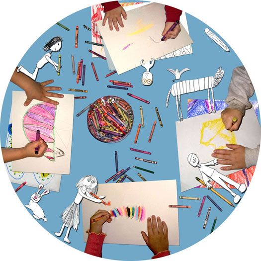
 I’ve photographed kids drawing at Starrett many times, and they are the best “models” because they are not modeling at all, they’re focused like laser beams on their work. I used those images, and many others, to create the work you see below. This is a 3 foot panel, which is the first of 10 in a 30 foot installation at the Captain Albert Stevens School in Belfast, Maine. (More about that project here.)
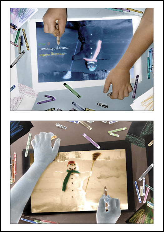
While I completed that commission nearly 8 years ago, these photographs of images appearing–flowing down through a child’s mind, arm, hand, through a crayon onto paper– are so beautiful to me, that they keep appearing in my work. Another example is the card below, which was my holiday card in 2009:
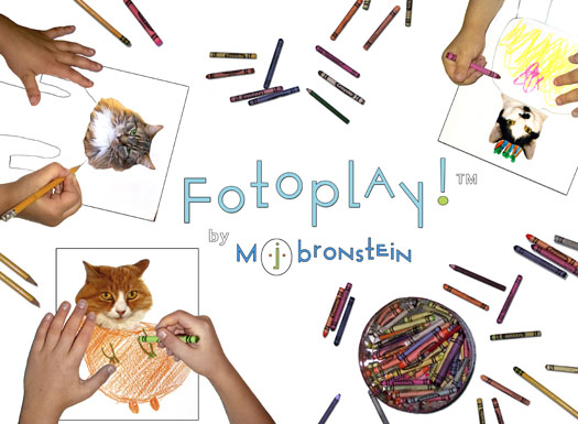
And circling back to the work at hand, my Fotoplay book cover. The version below was created this past summer, when I decided that the format of the book would need to be horizontal, to give kids a wide space for drawing, and an ease in flipping the cover up and out of the way.
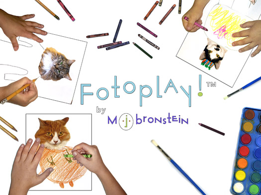
This fall, as things evolved even further, “buzzbubble” was tossed out, the process of trademarking Fotoplay began, and the cover went from blue to white. This cover felt quite complete, quite “correct” for my project, until we changed the interior paper to a much heavier stock, which allows for a much wider choice of media, like watercolor paint.
This decision led to ideas about a new cover.
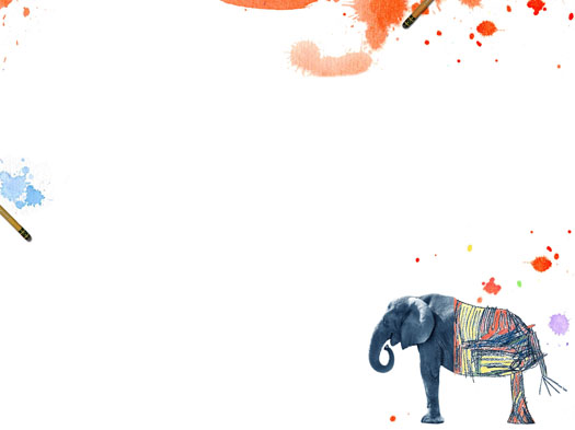
I began with the obvious, adding a tray of watercolors. And then I completely dismantled the cover, layer by layer. I created a total of 35 new layers, which would build up to the cover you’re about to see. The image below represents a stack of 9 lower layers.
 A few more layers gave some color to the elephant…
and then many more layers added washes of paint, colored pencils, and fat crayons.
What remains of the original cover is really what best reflects the spirit of my book: the word Fotoplay, the combination of photographs and drawings, and those hands…
Still to come: A sneak peek at my book trailer (!) currently in production and I have to say, looking AMAZING! This is a collaboration between two teen film/music wizards whom I’ve written about before: John Loxterkamp and Noah Fishman. Stay tuned!

